Blog

News + Announcements + Updates

Posts tagged Process
Spotlight in 100 Days of Lettering
 

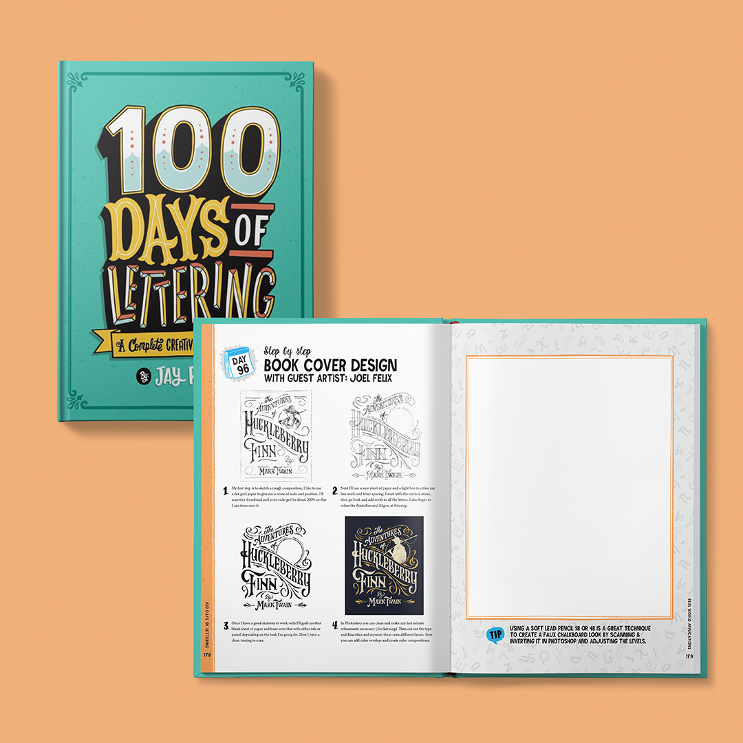
Congratulations to the talented Jay Roeder for getting his book "100 Days of Lettering: A Complete Creative Lettering Course" published. I'd also like to say thank you to Jay for including me in this project among other talented guest artists, and allowing me to share a snapshot of my lettering process.

Jay has several sections of lettering applications in this book from personal projects to real-world assignments. I chose to redraw a classic novel title "The Adventures of Huckleberry Finn" by Mark Twain. There have been many talented designers and artists take on this cover but it was fun to put my own spin and style to it.  Below you can see the progression from a simple thumbnail sketch to a more refined composition. 

This book is a must have for all aspiring lettering artists and those looking to explore Jay's unique and funky style of typography. So pick up your copy today to add to your library and expand your skillset!

 
By Jay Roeder
Buy on Amazon
Hand Lettering Process

I've been asked quite often on how I tackle some of my hand-lettering projects. So I thought I'd document a brief insight into how I work. The DBusiness Magazine cover turned out to be a perfect project to document.

I was first approached by Hour Media with the concept of doing a hand-lettering cover. I'd seen this done before, with so many great illustrators and hand-letterers (what comes to mind more recently Jon Contino's Washingtonian, and Dana Tanamachi's HOW magazine covers). I knew how I wanted to look in my head but translating what's in your head onto paper is what separates the best from the rest.

Here is what the client gave me to layout, with "Top Lawyers" being the main headline.
Top Lawyers in Metro Detroit 2013
1,000+ Honorees 
18,000+ lawyers surveyed
5-County region
Top law schools attended
52 specialized practice areas
Intellectual Property Law
Trusts & Estates
Family Law
Personal Injury
Product Liability
Business Law

Working out how the layout of headlines will flow.​

Finished  pencil drawing of how the headlines were laid out.

Refine it, and Ink it.

Final inking. 

You can begin to see hierarchy issues when it's all black and weight. Color plays an important role in calling out information and creating a smooth flow of hierarchy. Once you've got the final inking scanned in, ( I usually scan in at high-res 600dpi, so i can blow it up and control the Illustrator tracing filter better.) then you can clean things up in Illustrator. You'll notice I switched places between the "18K Lawyers Surveyed" and the "52 Specialized Practice Areas". I felt the 18K was competing with the "2013" in the headline in the original pencil drawing. Because this was now all vector it was easy to group things and move them around a bit. Refine your kerning, composition spacing and fix any alignment issues. I went through each headline and made refinements, some very minor, but remember, it's always the small things that make the difference.

​Introduce color. Yes I'm still on CS3.

I worked closely with the Art Director at DBusiness on color options and we ended up doing a three color (navy, teal and gold) solution which helped hierarchy. Something I learned in school, which you'd be smart to remember is "White/Paper is always another color." (thanks Gwen.) Especially when your on a tight budget and can only afford a one or two-color job, try and see how you can use the paper color to aid in your design. And there you have it. Once you package up your job and send the final files (along with the invoice) you have another cool piece for your portfolio. Cheers!

​Final cover art.

Top Lawyers Headline​